
Abyiss
Empowering consumers with the data they need to build their crypto-ventures with readily accessible information.
OVERVIEW
Abyiss enables consumers to make crypto-exchange decisions and collectively observe the influence various companies create in the market. Users can search, browse, compare, purchase and sell the numerous NFTs. Users can also activate the Abyiss recommendations while browsing in order to quickly and conveniently view market data on the NFT’s they are considering.
I collaborated with a team of designers to restructure and redesign the existing Abyiss website. Our goal was to enable users to easily find, understand, and act upon market data.
-
Time Frame
Aug. 2021 - Oct. 2022
-
Role
UI/UX Designer
Web Designer
Marketing Designer
-
Tools
Adobe XD, Figma, Canva, Adobe Photoshop, Adobe Illustrator, Adobe Premiere, Bluehost, Twitter and LinkedIn, Google Analytics
Challenge
People want to invest in cryptocurrency that are aligned with the values they care about and boycott the ones that don’t. Unfortunately, consumers often don’t have access to reliable information regarding specific cryptocurrencies are or know how to read the influences the market creates. Abyiss’ mission is to eliminate these barriers and empower users to explore the crypto market quickly and securely. In order to achieve this vision and grow their user base, however, they needed to address some usability issues in their existing product.
Our high-level objectives (which we further defined based on research insights) were to:
Increase user engagement and conversion by improving comprehension of the company's brand, mission, and UVP (unique value proposition)
Allow users to quickly and intuitively find cryptocurrency that are relevant to them
Allow users to easily evaluate displayed data to determine which actions to take
Research & Discovery
Because of the fledgling nature of the product, our team had limited data regarding users and their engagement with the crypto market. In order to uncover and prioritize the most noticeable user needs and usability issues, we employed the following research methods:
Competitor and comparator analysis
Comprehension/usability testing, in order to identify and address usability issues
User interviews and jobs-to-be-done analysis
Through our directed interviews we learned some key insights about new and existing investors who might be inclined to use a product like Abyiss:
They are often more motivated to purchase predetermined cryptocurrencies (such as Bitcoin) than to actively support newer meme-based coins (such as Dogecoin)
They use word-of-mouth, social media, and news sources to gather information about crypto patterns, but lack a singular source through which to reliably look up this information and view how these currencies measure against each other
70% of interviewees had searched for or were currently seeking a product with data about market history in order to help them make investing decisions
Scoping & Ideation
Our research led us to prioritize several main issues that needed to be addressed in the existing product:
Unintuitive navigation. We needed to overhaul the information architecture of the site to ensure that users could find the information and features they were looking for. We hypothesized that this would result in increased exploration and engagement with the products Abyiss provides.
Low comprehension of company mission and UVP. The landing page was not effectively communicating what Abyiss does, or why someone would want to use it. It was essential that we improve the content, copy and messaging throughout the site in order to increase comprehension and conversion rates.
Ambiguous data. Users were confused by how the data was presented, and were not sure whether a certain percentages were relatively bad or good. Some users expressed skepticism about the trustworthiness of the data. We needed to clarify the terminology used and best practices to develop a clear percentage definer that would appear credible and easy to understand at a glance.
We first addressed the navigation issues by constructing a new site map.


With a better understanding of our users and the main issues we needed to address, our team began generating wireframes for each page of the website to explore potential solutions to these problems.


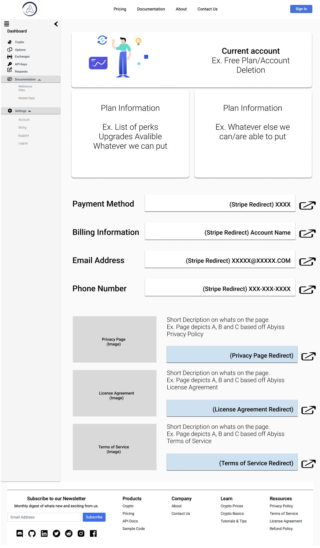
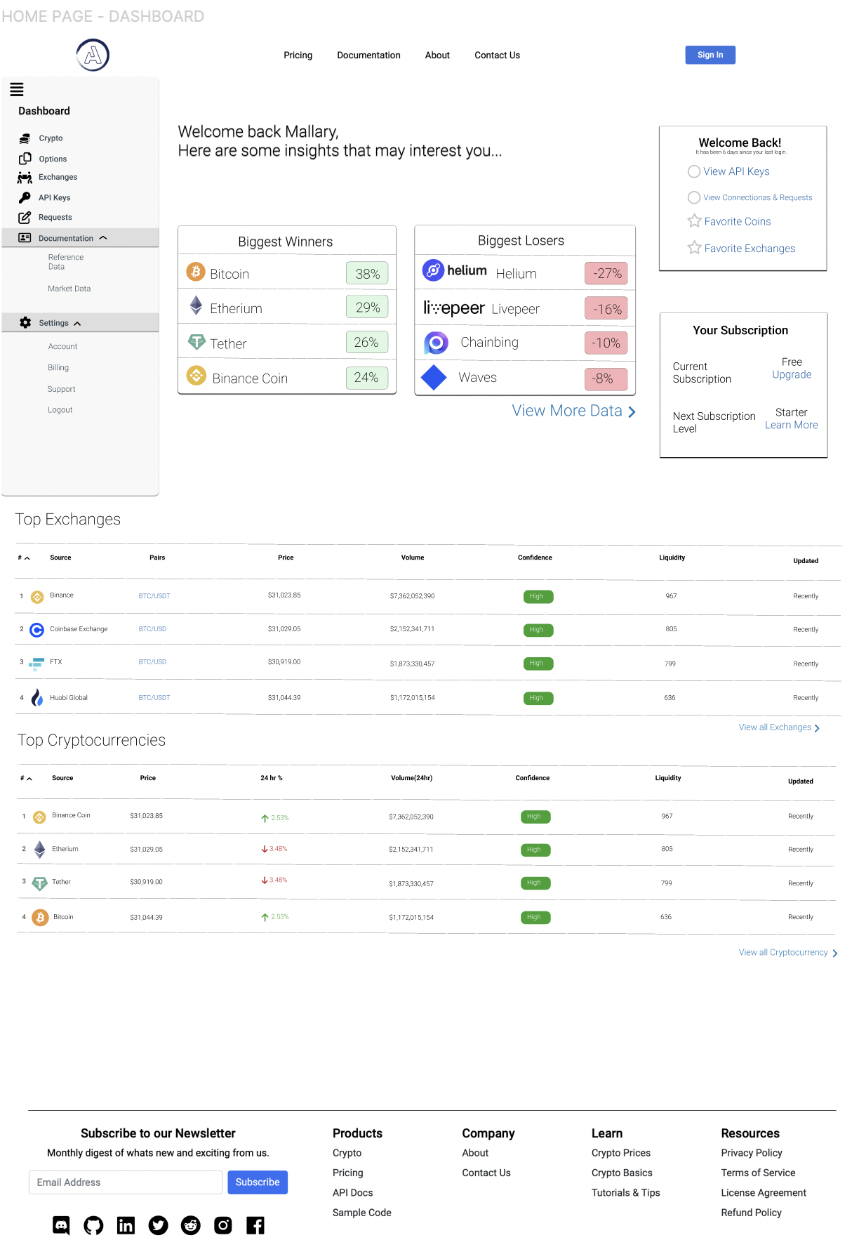
From this stage forward, my personal focus was the user profile. Abyiss users have the ability to search, browse, or compare data on cryptocurrencies by signing up for an account allowing for a personalized experience. My goal for this site was to provide as much value to the user as possible during their logged-in experience to help retain active users.

We determined that this new user profile would include:
Favorited cryptocurrencies. This would allow users to track or save cryptocurrencies for future reference and give Abyiss metrics on which tokens were popular or trending amongst users.
Favorited tokens. Because Abyiss generates revenue from commission of sales, it was essential that we allow users to easily save and locate the tokens they were considering for purchase and/or sale at a later time.
Improved ranking of causes. A logged-in user would see personalized ratings on a token’s profile based on their recent searches and recommended market trends. Although we wanted users to identify all of the cryptocurrency they were interested in, we also wanted them to select their main goal of investing in order to display personally recommended tokens to remain on the lookout for. This presented the unique challenge of designing a two-tiered rating system. This would also allow Abyiss to track which tokens are the most popular among their users.
Prototyping & Testing
I created a clickable prototype to test potential solutions. The results of my low fidelity prototype came up inconclusive, however my mid fidelity prototype (shown above) generated an abundance of rich feedback, revealing a number of issues:
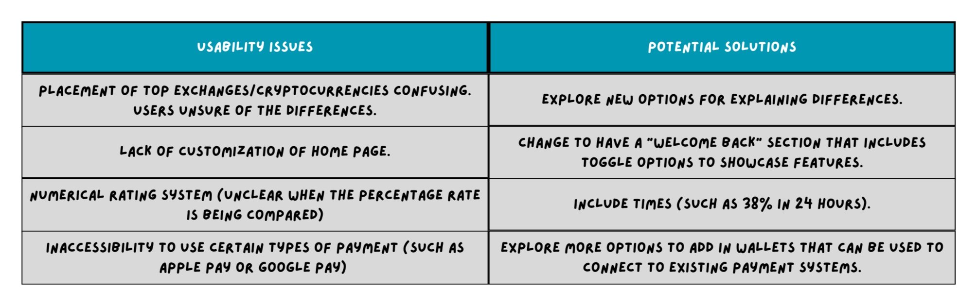
Iteration & Testing
The weaknesses exposed in the previous round of testing gave me a lot to improve on. I explored multiple possible solutions for personalizing features, one of which is shown below:


Ultimately, a decision was made by the CEO to only prompt the user have certain features always be set; such as favorite coins and exchanges. However, it was noted that possible changes to feature settings would be expanded further in future implementation.
Evaluating Success
Our final prototypes proved successful in a usability standpoint, recording improvements across the board in user comprehension, ease of navigation, and interpretation of data. On the user profile,
5/5 of users tested correctly identified the purpose of the various tokens and their categories
4/5 users were able add a product to their Favorite Coins in one attempt
5/5 users were able to remove a token from their Favorite Coins in one attempt
Lessons Learned
During this project, I encountered challenges that helped me develop my product thinking, gain experience with new research methodologies, and grow enormously as a user focused designer. In addition for being an advocate for the user, I learned new methods and best practices for:
Future-proofing to allow for as much flexibility in my designs as possible for features that could be added later in the product roadmap.
Designing thoroughly for all possible states and edge cases. What will the site look like if the user has no favorited coins? What if they have 50? What will happen when in the case of a recession or economic boom?