
OG Dazzle
UI and UX Design for a skincare startup that focuses on diversifying the industry by advocating for self-love.

OVERVIEW
OG Dazzle LLC. is a cosmetic and skincare start up on which customers can easily venture into the organic skincare, makeup and accessories market. My role on the team was to create a new brand identity for the startup to help them effectively transition to this competitive trade.
-
Time Frame
Aug. 2020 - Sep. 2021
-
Role
UI/UX Designer
Website Designer
-
Tools
Google Analytics, Adobe XD, Adobe Photoshop, Adobe Illustrator
Branding
Together with the client, I worked to develop a new brand identity that would effectively communicate their values. Because they were handling skincare and cosmetic products, it was important that they be perceived as being trustworthy and reliable. They also wanted to be seen as approachable, because their end user could easily be someone who is not accustomed to using organic products. Using a pre-determined logo and colors I developed a mood board to retain the companies’ vision and mission.


Research & Discovery
Due to the recent emergence of the site, our team had limited data regarding users and their engagement with the cosmetic industry. In order to uncover and prioritize the most noticeable patterns that drew customer interest and retention, we aimed to determine stable patterns from existing companies:
Legibility/Comprehension of site
Approachability with products
Through our directed interviews we learned some key insights about new and existing clients who might be inclined to use organic products from OG Dazzle:
They are often more motivated to purchase organically made skincare to provide sustainability for future generations
They use word-of-mouth, social media, and news sources to gather information about upcoming products and are more drawn to flashy, memorable commercials
Scoping & Ideation
Our research led us to prioritize several tasks that needed to be addressed in the production of the site:
Navigation. Ensuring that users could find the information and products they were looking for is essential for a skincare and cosmetic company. We hypothesized that creating an ease in navigation would result in increased exploration and engagement with the products OG Dazzle provides.
Showcase of company mission and products. The landing page needs to effectively communicating what OG Dazzle strives to provide, and why someone would choose them over rival companies. It was essential that we present the products positively throughout the site in order to increase comprehension and conversion rates.
We first addressed the design issues by constructing a site map.


Prototyping & Testing
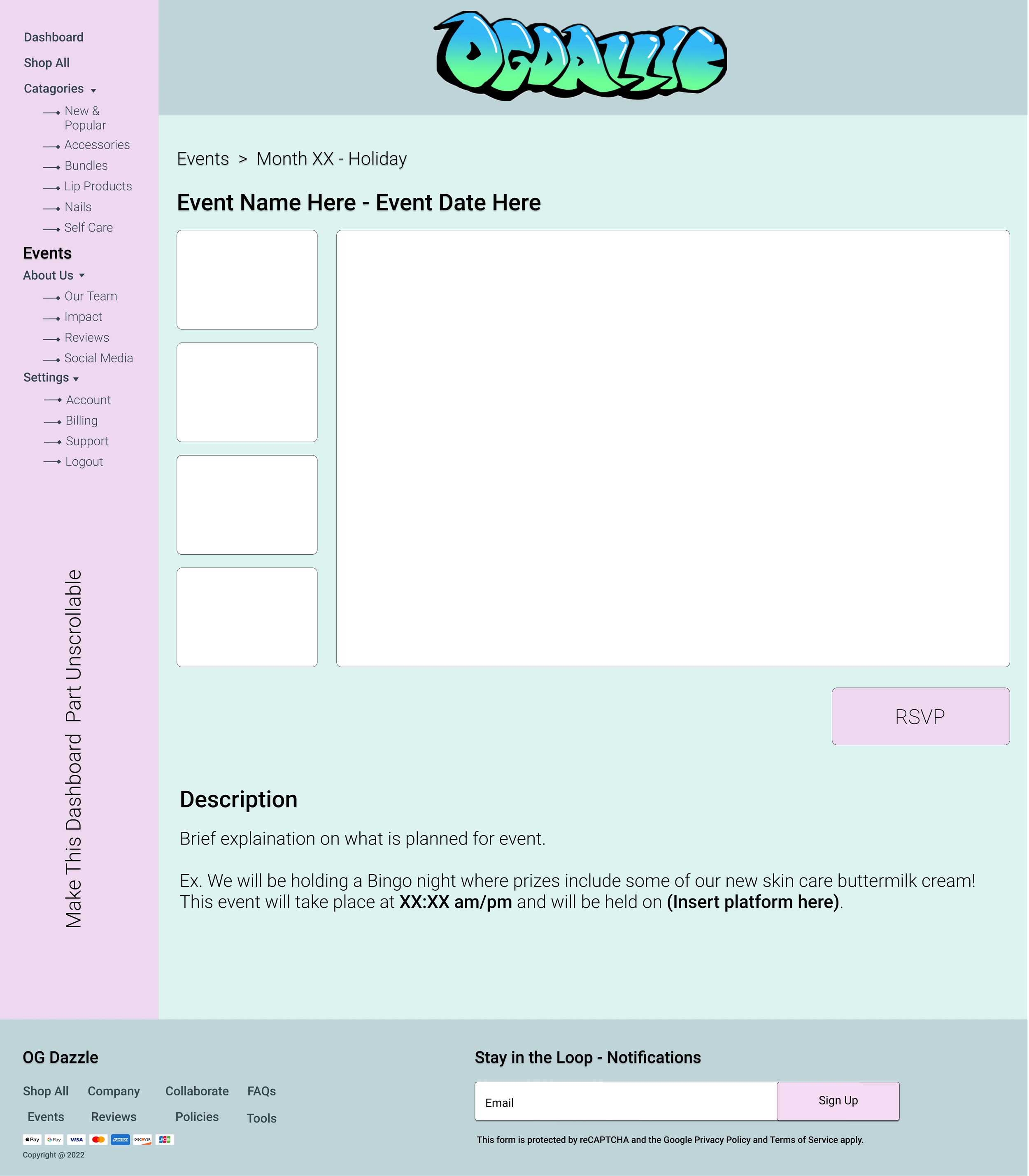
I produced a clickable prototype to test potential solutions. The results of my low fidelity prototype came up inconclusive, however my mid fidelity prototype (shown above) generated an abundance of rich feedback, revealing a number of conflicts:

Ultimately, a decision was made by the CEO to simplify the design of the site; especially the about us page, landing page product displays and contact us section. (Low fidelity mock ups can be seen below).


Iteration & Testing
The weaknesses exposed in the previous round of testing gave me a lot to improve on. I explored multiple possible solutions for personalizing features, one of which is shown below:


Lessons Learned
During this project, I encountered challenges that helped me develop my product thinking and grow tremendously as a designer. In addition for being an advocate for the user, I learned new methods and best practices for:
Creating flexibility in my designs for possible for features that could be removed or included later in the product roadmap. As well as crafting designs that may clash with my own personal design style.